Originally published 26 April 1993
In the autumn of 1728, Samuel Johnson, future author of the famous dictionary, rode with his father from his birthplace at Lichfield in the English Midlands to the university town of Oxford. He was 19 years old.
Johnson’s biographer, John Wain, describes the countryside that young Sam passed through: “It was a place in which ugliness was very rare; indeed, with the important exception of the ugliness that disease and disfigurement produce in human beings and animals, ugliness was unknown.”
I thought of this startling statement the other day as I drove along Route 138 through Stoughton and Canton, a typical commercial strip of nonstop ugliness. At every turn my eye was affronted by clashing styles and tawdry materials. I tried to imagine the beauty of the English countryside that Johnson traversed in the glowing autumn of 1728.
Wain continues: “In [Johnson’s] day there was probably no such thing as an ugly house, table, stool or chair in the whole kingdom. The reasons for this…is that industrialism, by moving people away from the natural rhythms of hand and eye, and also from the materials which occur naturally in their region and to which they are attuned by habit and tradition, cannot help fostering ugliness at the same time as it fosters cheapness and convenience.”
Samuel Johnson lived in the last glorious days before industrialization transformed the English countryside. Visually, English life was at its best, for even the poorest of the king’s subjects.
Of course, the visual aspect of life is not everything. In Johnson’s England, the nose was assaulted on every side by the stench of raw human and animal waste, and safe drinking water was in short supply.
Post-industrial society eventually confronted and solved both problems, with the construction of vast public schemes for the supply of pure water and removal of sewage. Similarly, medical technology eventually ameliorated the ugliness in humans and animals caused by disease and disfigurement. Indeed, a fair comparison of the advantages and disadvantages of life in Johnson’s time and our own would almost certainly give preference to the 20th century, even with its visual flaws.
But the visual quality of life is important, and it seems we are in full retreat from visually harmonious surroundings. The regional materials and styles to which we are attuned by habit and tradition (timber in New England, limestone in Indiana, adobe in Santa Fe) are replaced everywhere by ubiquitous vinyl, phony brick and stone veneers, and faux-mansard facades. Cheapness and convenience rule the day, with ugliness as their corollary.
Industrialism — in itself — should not be blamed for this. The Machine Age has produced some remarkable examples of visually satisfying environments.
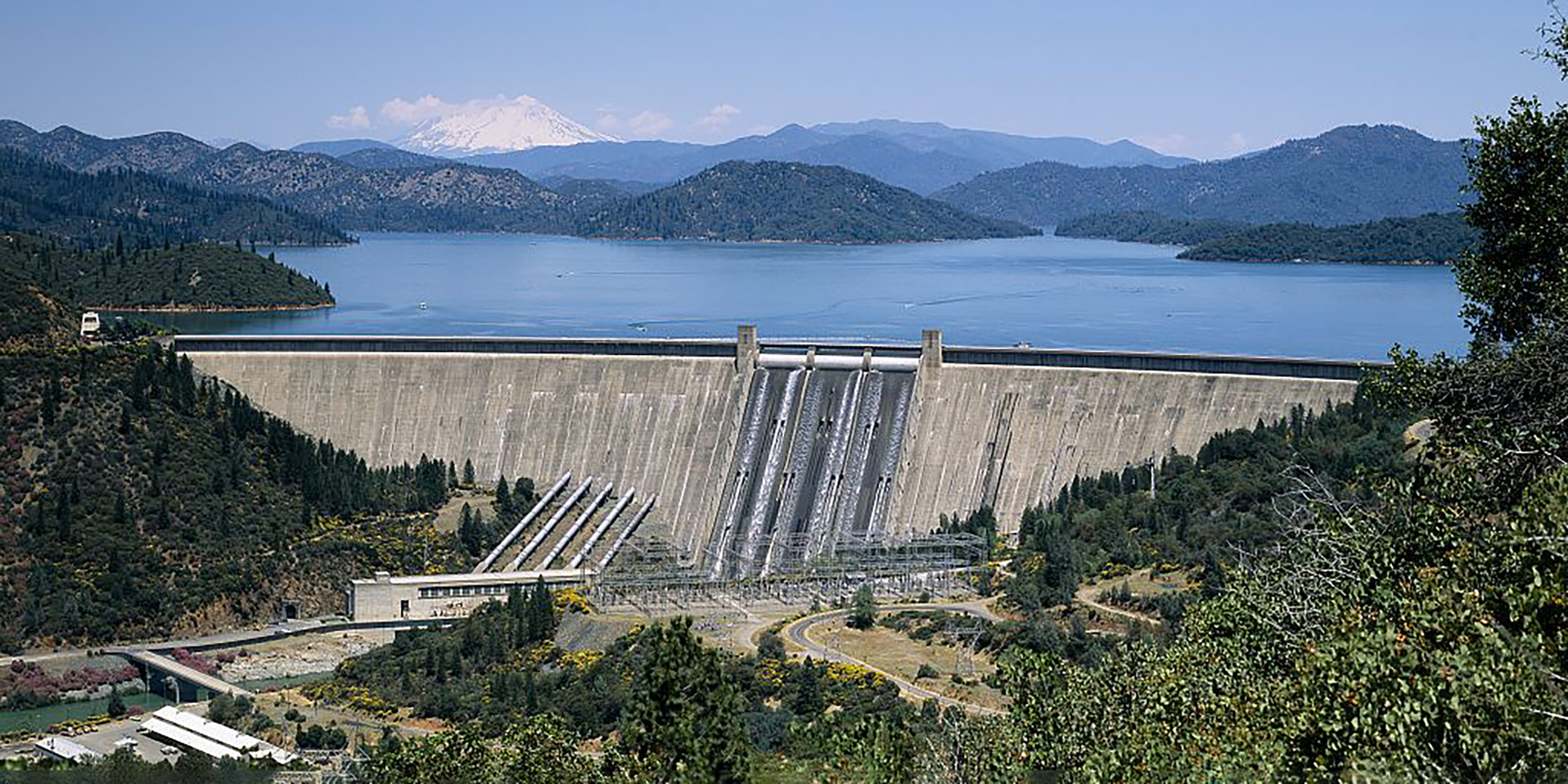
I grew up in the valley of the Tennessee River when the TVA (Tennessee Valley Authority) was in full flower. Like many others of that time, I was dazzled by the beauty of the great dams (with Art Deco decorations) that TVA engineers threw across flatland rivers and mountain streams. I remember thinking that Fontana Dam in the Great Smoky Mountains was the most beautiful thing I had ever seen.
The landscapes flooded by the dams seemed then no great visual loss: dirt roads, tin-roofed shacks, ramshackle barns with “Mail Pouch Tobacco” signs painted on their sides. In retrospect, I can better appreciate the visual integrity of that vanished landscape, but the dams remain for me great monuments of pleasing design.
The automobile parkways established early in this century were another visually stunning contribution to the landscape. My first trip north by car from Tennessee was along the Blue Ridge Parkway and Skyline Drive of North Carolina and Virginia. It was a slow journey, but visually as satisfying as anything Samuel Johnson might have seen on his way to Oxford.
I remember being made breathless by my first drive along the Merritt Parkway in Connecticut. Every bridge over the parkway was a different jewel of design, the journey an adventure of visual discovery. That such a thing ever came to be built seemed a miracle.
Now, the Merritt Parkway is under assault by the forces of cheapness and convenience. Each successive drive to or from New York along the parkway finds one more encroachment upon the visual integrity of what used to be. Generic steel I‑beams replace the exciting collage of styles and materials in the original bridges.
In Boston, proposals to spend one-half-a-percent of construction budgets on artistic enhancements of the Central Artery and Third Harbor Tunnel are protested by tight-fisted taxpayers who have forgotten the lessons of the past, or simply don’t care about the visual beauty of the environment.
Artifacts of the industrial age need not be ugly; consider the beauty of Rockefeller Center, the Golden Gate Bridge, the Texaco and Gulf gas stations of the 1930s, and the federal post offices of that same economically depressed but design-conscious era. The visual blight that has come to afflict our public ways represents a lapse of judgment and resolve, not any necessary consequence of machines.
There is no way back to Samuel Johnson’s pre-industrial landscape. We can and must coexist with technology. With public vision and private generosity we can create engineered environments that please the eye even as they serve our practical needs.


